A real guide to customizable online donation forms
Updated November 14, 2025

Online donation forms are the baseline for nonprofit fundraising. They’re the backbone for most organizations. Whether these organizations are running ticketed events, peer-to-peer campaigns, or DIY campaigns, you’re always going to have at least one long-standing donation page set up on your site. Those are the pages that quietly drive gifts day in and day out without all the extra push work.
The problem is that many nonprofits set up a templated page once, maaaybe swap out a logo, and never think about it again. But the donation page is where the “money ask” happens. There’s a lot of psychology wrapped up in that moment. It’s about trust, legitimacy, and how confident a donor feels about giving to you. That’s why the donation page ends up shaping not just conversion rates but also how people see your brand and whether they come back to give again.
Additionally, trends in how donors interact with forms continue to shift (with some generational nuance, of course). For instance, mobile is huge now. Most younger people don’t want to pull out a laptop or even their wallets. They expect to be able to donate right from their phone. Apple Pay, Google Pay, PayPal, those kinds of quick, seamless options matter a lot. Donors want the process to be fast and easy.
The challenge for nonprofits is to keep that flow short and simple while still communicating their brand and message.

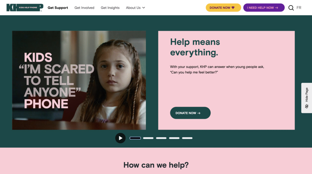
An example of a donation page (Kids Help Phone)
So, what does “customizable” really mean?
With online donation forms, “customizable” means much more than dropping in your logo and brand colours. A customizable form means you control the entire flow, including your request from donors, how you ask, and how the donor experiences these requests.
That control covers deciding on donation types, necessary donor information, and suitable language, among other things. Customization is really about making the form feel like your organization, while keeping it easy and clear for the donor.
Considerations when building an online donation form
A few things nonprofits should think about when they’re creating or refreshing a donation page:
- Be intentional. Don’t settle for the default. Don’t just use the standard template and only replace your number or logo. Think through what your organization’s needs are, design a flow that matches those needs, and keep the asks as simple as you can.
- Match your brand. Ensure the page feels like it’s part of your site, not something separate or generic. That includes brand colours, fonts, photo styles, icon/emoji choices, footer, header, and other elements.
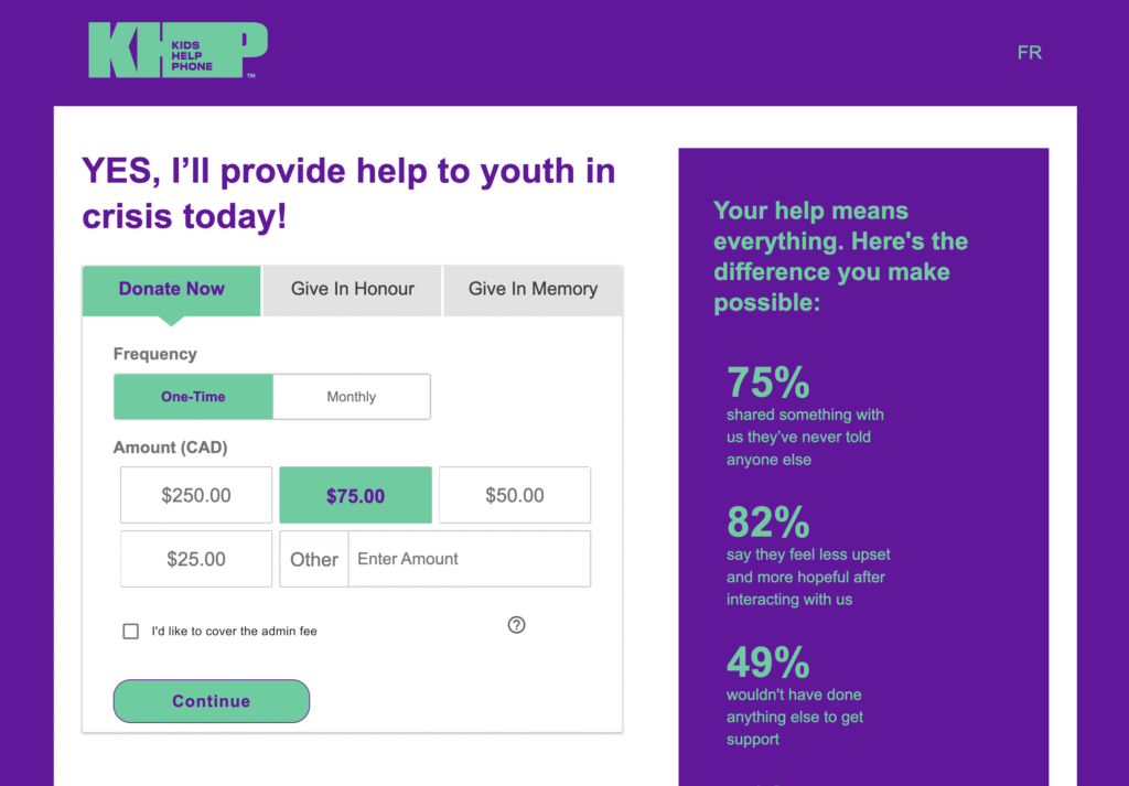
Side-by-side comparison of the home page and donation page, showing consistent branding (Kids Help Phone)
- Plan your donation type. Are you asking for one-time donations? Monthly? Separate campaigns? Decide up front and design the flow to allow potential donors to navigate the page easily and find the campaign type most relevant to them.
- Use your own voice and tone. Customize terms to fit your way of communicating with supporters. e.g., “tribute giving” doesn’t have to be called “tribute giving” if your community uses a different phrase. Also, do you want donors to feel hopeful? Urgent? Inspired? One research report in the Journal of Consumer Psychology found that forms that combine positive feelings of strength and negative emotions of sadness (to evoke empathy) led to more donations than those built around just sadness or just strength.
- Use your supporters’ language. If your organization targets a multicultural/lingual supporter base, ensure that they can clearly understand the language on your donation page. For example, in Canada, you need to provide both English and French versions of the same online donation page.
- Prioritize mobile. Test both desktop and mobile, but on mobile, especially, ensure that your donation form is “above-the-fold” because you want the form to be right there when the page loads. Providing impact stories and other necessary context is essential, but if donors have to scroll too much, some won’t realize the form is even there.
Common mistakes to avoid when setting up online donation forms
Some of the common mistakes we see:
- Not checking all the pages in the flow, like the success page or the failed transaction page. Avoid this mistake so key donor touchpoints aren’t left off the form.
- Overlooking the thank-you page. This is a huge opportunity to thank your donor, show impact, and keep them engaged, but it is often overlooked.
- Not customizing message templates. Those post-donation emails can feel impersonal if left at their default settings.
- Irrelevant or too many fields. Do you really need someone’s middle name? Probably not. Every extra field adds friction.
- Generic donation amounts. Using default amounts (like $25, $50, $100) without checking what makes sense for your donors. Ignoring this can mean missing out on higher donations or scaring off donors who typically give less than the defaults.
- Too much text above the form. Especially on mobile, this can bury the actual giving fields and reduce conversions. The form itself should be visible and easy to use right away. If there’s too much text or imagery above it, especially on mobile, that can get in the way.
How raisin empowers nonprofits with customizable online donation forms
raisin’s online donation forms are built to be easily customizable for nonprofits and seamless for donors, with tools that go beyond the basics of collecting a gift. Here are a few ways that using raisin enhances the online donations experience for your donors and your team:
For donors:
- Personalized thank-you flows. Every donation can trigger its own thank-you page, follow-up emails, and even reminders, making stewardship automatic without losing the personal touch.
- Flexible giving paths. The platform supports everything from one-time and monthly giving to tributes, corporate matching, and donor-covered fees, so you can align the form with the way each supporter wants to give.
- Optimized for any device. The forms adjust seamlessly to both mobile and desktop, featuring a simple layout that keeps the focus on the donation itself.
- Connected to the bigger picture. raisin integrates with CRMs and email platforms, allowing donation data to flow directly into the rest of your supporter journey.
For nonprofit teams:
- Choose the correct setup for your campaign. You can launch a standalone donation form or create a micro-site depending on your needs. A single form is quick to set up and ideal for evergreen giving, while a microsite gives you multiple content pages and more storytelling opportunities to connect with donors.
- Embed forms directly on your website. Instead of redirecting donors away from your site, raisin allows you to embed the donation form inline. That continuity reinforces brand trust, keeps the experience seamless, and helps boost conversion rates. {This feature is currently in closed beta}
- Adapt gifts when donors need change. If someone requests to update their recurring gift type or adjust a tribute card, you can make those changes in the admin console without disrupting their history or reporting.
- Stay on top of reporting. The Donations Summary Report provides a real-time view of gifts received, including totals by campaign and detailed breakdowns by gift type. That visibility helps you adjust your forms; for example, now you can easily change default amounts to better match average donation sizes.
Online donation forms might seem like a simple function, just a way to collect gifts, but they’re actually a core part of how nonprofits raise money, build trust, and shape their brand. The more intentional you are about customizing them, the stronger your results will be.
Words by Sonia Amadi and Alexandra Le Blanc